Consent and Convert: A Guide to Boosting Your App’s Opt-In Rates
Tired of seeing users hit that dreaded “decline” button? Consent screens giving you nightmares? You’re not alone in this horror story. Let’s transform those consent goblins into conversion gold.

Less is More: The Art of the Simple Consent Screen
We’ve learned a surprising truth: sometimes, less is truly more. Overloading your users with information and flashy graphics can actually backfire. Consider your consent screen a polite request, not a persuasive sales pitch. Keep it clean, simple, and to the point. In this rare case forgettable is king!

Matchy-Matchy: How to Make Your Consent Screen Feel at Home
Want to add some flair to your consent screen? Go ahead, but make sure it feels like a natural extension of your app. A consent screen that clashes with your app’s style is like wearing mismatched socks – it just doesn’t fit. The key is to keep the app immersiveness.

Buttonology: The Science Behind the Click
The words on your buttons matter more than you might think. Keep it concise and clear. “Decline” and “Accept” are often your best bets. Fancy phrases might sound impressive, but they can actually hurt your opt-in rates.
Color Your World: The Psychology of Persuasion
Colors can evoke emotions and influence decisions. A bright, eye-catching CTA button paired with the same color as your app title can create a subtle psychological connection. And don’t forget about that “decline” button – a grayish hue can subtly nudge users toward the “accept” option.
Ditch the Distractions: Focus is Key
We’ve found that those extra icons and graphics in the middle of the screen can be more distracting than helpful. Sometimes, less clutter leads to more conversions.

Find Your App’s Color Palette: A Match Made in Design Heaven
Your app’s color palette should reflect its personality. If your app is all bright and bubbly, choose colors that match that vibe. A consistent color scheme can help create a cohesive and professional look.
Icon Impact: A Small Change, a Big Difference
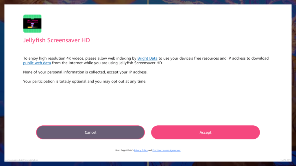
Don’t underestimate the power of a familiar face. Adding your app’s icon to the consent screen is like a friendly handshake. It instantly boosts trust and recognition, making users more likely to hit that ‘accept’ button. It’s a small change that can make a big difference in your opt-in rates.
By following these tips, you can significantly improve your app’s opt-in rates. Remember, every app is unique, so experiment and find what works best for your users. And most importantly, have fun with it!
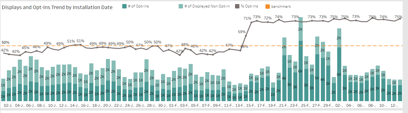
Want to see a prime example of a consent screen done right? Check out our high-performing screen that follows these principles and boasts an impressive opt-in rate of over 80%.
Say Yes to Success!
By following these tips, you can significantly improve your app’s opt-in rates. Remember, every app is unique, so experiment and find what works best for your users. And most importantly, have fun with it!